
Imagine you’re creating a presentation to an outsourced team to relay your performance data and your expectations. And then imagine their reaction if all your slides are just paragraphs of words and numbers.
First, you know that it would be a bit dull because looking at pure text can be overwhelming and mind numbing at times. (Trust me, as a writer, I know how that feels).
Second, it will take twice the amount of words for your outsourced team to fully understand how your performance works.
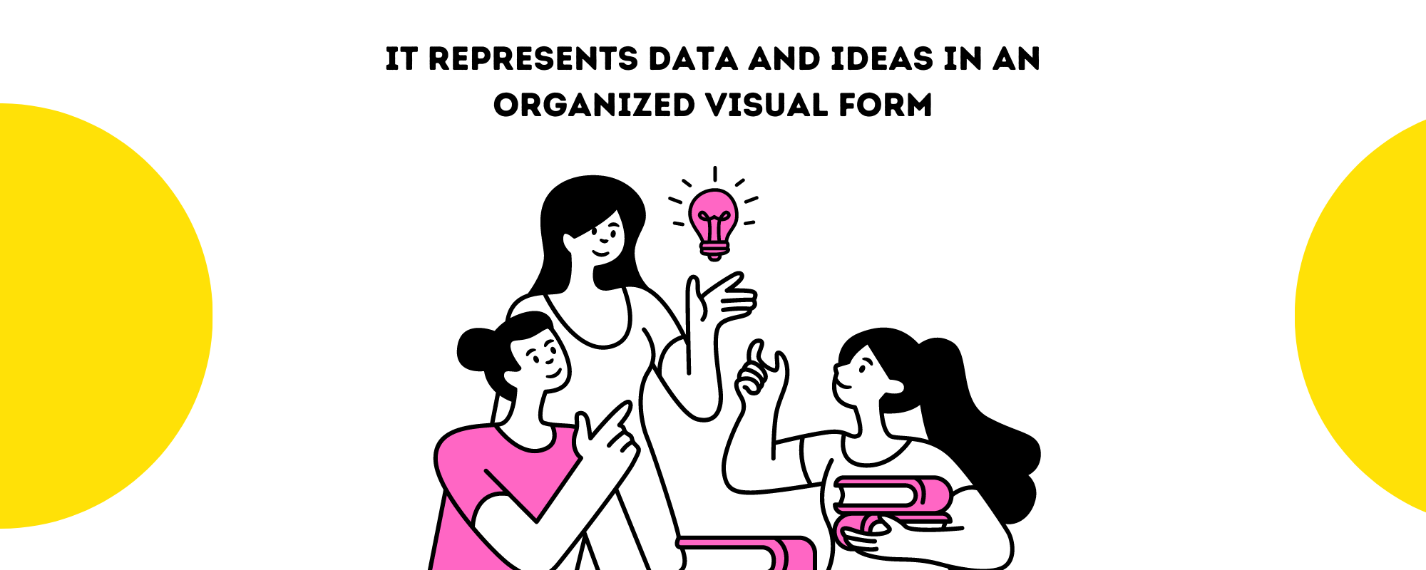
Complex ideas are best explained through multiple types of media, especially if you’re working with multiple types of data.
Explaining things through only one medium is ineffective if you need people on the same page.
People have different learning styles and some don’t have particular context to the conversation, making it more difficult to follow.
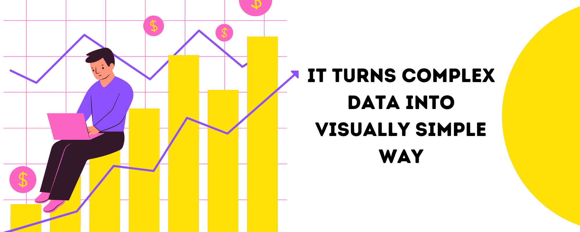
The easiest way to relay and elaborate on complex ideas is through data visualization.
What is Data Visualization?
Data Visualization is creating visual media that represents ideas. It’s created to organize, represent, and portray data as a visual element to relay or reinforce information that consists of multiple data points.
Here are the most common ways we visualize data:
- Charts
- Graphs
- Diagrams
- Maps
- Plots
- Infographics
- Animations
Data visualizations can be created as a stand-alone representation of data, but most commonly it’s an additional media that accompanies an explanation. Here’s an example:
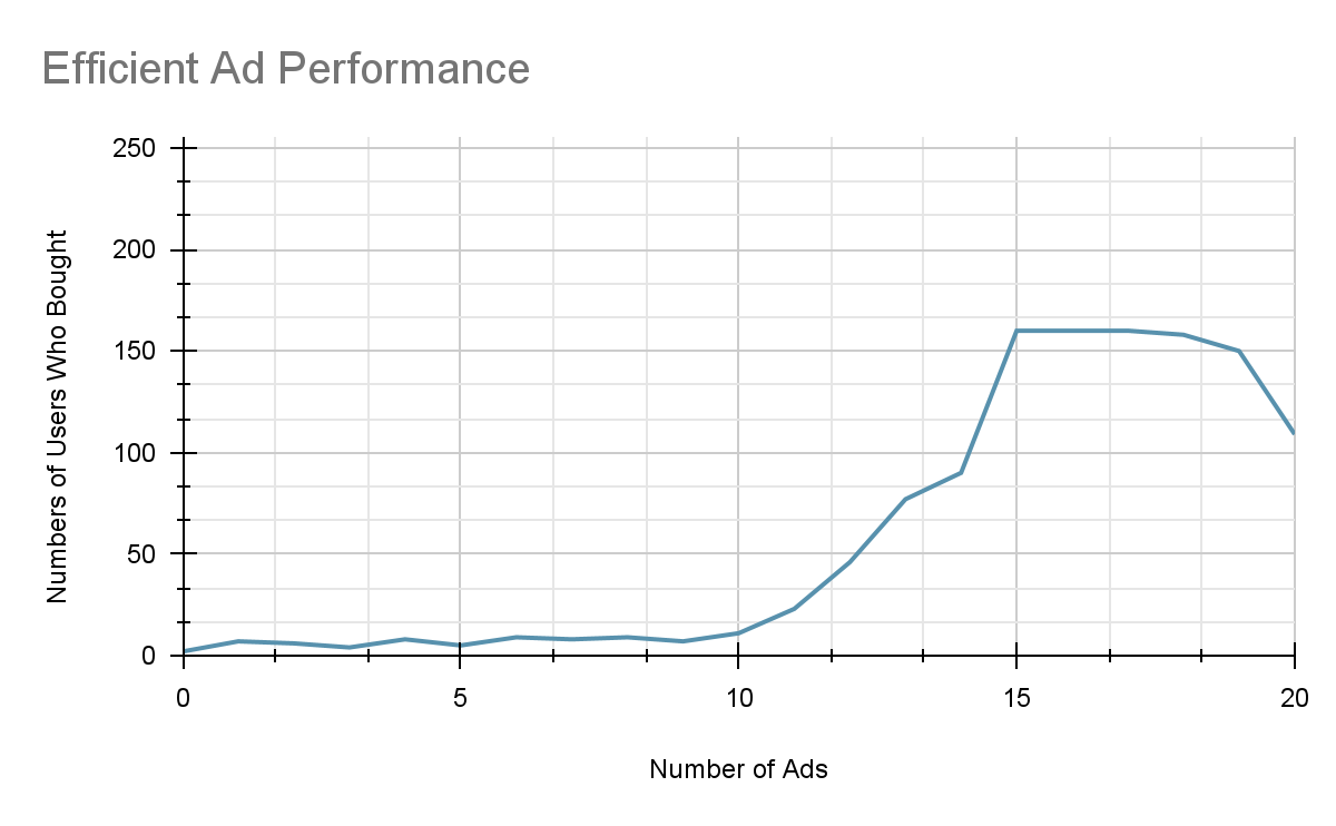
Our website has an average of 255 visitors per month. We are showing the visitors a max of 20 ads per month and we have found that 15 ads are the highest performing number.
63% of visitors (160 visitors) bought if they came across 15 ads on social media. 10 ads is the tipping point. Starting from 10 ads up to 15 ads, the effectivity of making them buy rises exponentially.
But after 15 ads, the diminishing returns kicks in. Most of the results are still on the 150 – 160 range but some are even going down, with a large dropoff on 20 ads.
Based on the comments on social media and comments given to our customer service reps, 20 ads are already getting too much for the audience. That’s the reason why there is a big drop-off at the end.
So in conclusion, the most efficient number of ads to produce sales is 15.
10 ads per month is enough to move the needle a little bit but the minimum recommended ads we need to produce per month is 13 in order for us to break even.
Here’s a chart that breaks down the number of sales vs the number of ads shown to users:
Why Data Visualization is Important
Aside from explaining a complex idea or corroborating the details of a complex idea, there are multiple benefits to having your data visualized.
Addressing Multiple Questions
When a spread of data has been presented, there will naturally be questions. It can be from stakeholders that are directly involved with the data or specific departments trying to understand the conversation.
From the example that we have earlier, here are some of the questions that are implicitly addressed.
- How many visitors do we have on the website per month?
- How many is the max number of visitors who purchase on our website per month?
- How many ads produces the most amount of sales?
- Which is the point of diminishing returns when it comes to ads?
- How many ads should we show to break even?
Even if these questions are not explicitly asked, people can already infer it from the explanation and the visualization.
Addressing Multiple Stakeholders
In our previous illustration, there are multiple departments that are the main stakeholders of the data: Sales, marketing, customer service, and the data analysts.
The sales and marketing team are the main ones who will benefit from the illustration. The data analysts provided the insights to generate the visualization. Lastly, the customer service provided contextual information about the sudden drop-off.
If the report and illustration weren’t created by the data analysts, then it would take multiple emails to relay this large amount of data.
And not all departments have the same availability, especially when working with outsourced teams.
Sometimes, just coordinating a meeting time is difficult enough because overseas outsourced teams have different time zones to clients. And if you work with multiple teams scattered all over the world, it would already be a full task by itself to schedule meetings.
Having a visualized report already saves so much time. It already is a great conversation starter, multiple concerns will be addressed, and it will still be effective even if sent through email.
Saving Time and Effort
Speaking of saving time, getting a lot of information understood at a glance is a great benefit of visualization. Not everyone has time to sit around in a meeting, especially for outsourced teams.
We already mentioned earlier that scheduling is already a challenge for offshore teams. So having an easily understood illustration will remove unnecessary back and forth. Saving time to produce emails for explanation and the saved time can then be translated into more productivity.
The Same Page
Having an illustration makes multiple teams start on the same page, literally. It will be a great jumping off point for conversations and an even great reference to go back to.
It will be even more beneficial when the illustrations are dynamic and connected to a constantly updated database. No need for the data analysts to manually create an illustration and send it through the various departments.
A Different Perspective
Since the reference is based on images with text descriptions, people with unique insights or may just have been looking at the data visualization differently can provide valuable perspectives.
In our example earlier, we had 2 main takeaways. 15 is what we consider the best number of ads proportional to sales. 13 is the minimum number we should aim for to break even.
But one team member spots the plateau on the graph. 15, 16, 17 ads all have the same results. So their hypothesis is that 16 is actually the safest number to aim for.
While 15 is the most efficient and 17 is close to diminishing returns, both numbers are at the edge of the plateau. They are closest to dropping sales.
So in order to be really safe from dropped sales, 16 ads is the magic number we should aim for.
From this point on, it’s up to you whether to follow the latest suggestion or the previous conclusion. But we can’t understate the importance of having a unique insight that even the analysts did not realize.
Fosters Conversation and Collaboration
Also having the same jump off point and encouraging different perspectives definitely breeds conversation. Open conversation then promotes collaboration.
The best ideas and implementations are cooked through conversations and collaborations. It’s going to produce a net good within your organization, especially when working with an outsourced team.
Promoting open dialogue within the organization, allowing diverse perspectives strengthens the organization. It unites the people, elevates the skills of everyone in the organization, and makes sure that each decision is optimal.
Outsourcing Data Visualization
Data visualization is a unique expertise and that is one of the main reasons why it’s outsourced, the other reason being saving money.
Unique Skills Needed
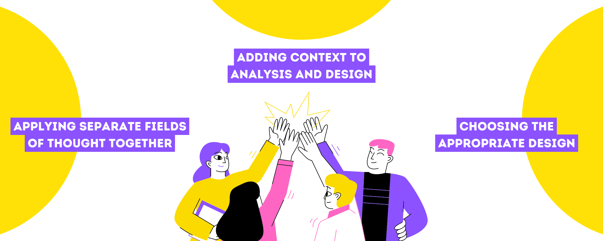
Applying Separate Fields of Thought Together
Data Visualization is a mix of Data Analytics and Graphic Design, 2 different skill sets and even 2 different philosophies: Logic and Creativity. It’s even stated that the analytical and creative side of the brain are controlled by the opposite hemispheres of the brain.
Data visualization is a balance of science and art. But the secret ingredient to making data visualizations work is context.
It’s not enough to have analytical prowess and an eye for design. You also need to have great communication skills.
Adding Context to Analysis and Design
Because the main point of creating data visualizations is relaying complex ideas and a multitude of information into at least one graphic. Even if the analyst is able to extrapolate a lot of data and create amazing graphics, it won’t matter if no one understands it.
The most important part of the graphics are the details within. In our very simple illustration above, it will be difficult to understand if we remove the labels on the x and y axis, even if we already have a lengthy explanation earlier.
Adding those contextual details and not choosing form over function is definitely a skill that graphic designers and data visualization professionals should have.
And going back a little bit, choosing the data that would be presented and choosing an appropriate graphic to illustrate the data already provides context. Because people already have an expectation once they see a specific type of graph.
But choosing the right data set and graphic isn’t that easy of a task.
Choosing the Appropriate Design for the Data Set and Vice Versa
We have enumerated earlier that there are at least 7 common ways to illustrate data. But each way has its own types and categories that cater to different data sets. According to Visme, there are 44 possible types of visualizations that you can use.
And those are the ones who have set rules that distinguish each visualization. Line graphs are distinctly different from bar graphs and they are each used to present data differently.
Line graphs indicate progression while bar graphs indicate comparison, to say the least. Knowing the appropriate visualization is crucial to communicate the idea across. Conversely, picking the wrong graphic can lead to confusion.
It takes expertise to choose the right graphic to serve the data or even manipulate the data to serve a graphic.
Lastly, there are circumstances in which a data visualization professional has to present unique data with a unique premise to illustrate and it doesn’t apply to the conventional graphs, charts, maps, plots or diagrams.
They would have to create bespoke visualizations or incorporate animations which is another layer to a graphic designer’s area of expertise.
The Challenge is Finding This Unique Set of Talents
At the surface, it might seem fairly easy to create data visualizations. But as we have elaborated the skills it takes to create effective visualizations, it does not just one skill. It takes multiple, opposite skill sets working together.
Finding unique teams or even individuals that create data visualizations can prove to be challenging. It’s fairly easy to find graphic designers but it’s challenging to find data analysts.
You might say, we already have tools that can generate graphics by entering data or platforms that have them by default. And it’s a fair point. However, not all tools that you use have that capability and there will always come a time when you need to produce your own:
- When hiring new employees
- Communicating through other brands
- Infographics for users/consumers
It’s challenging to find a graphic designer who can process data as well as analysts do. Or find analysts that also have the creative chops to create graphics.
However, these uniquely talented teams and individuals are abundant among outsourcing platforms and agencies.
Save Money by Outsourcing
But not only will you easily find professionals capable and even experts at data visualization through outsourcing, it will also take less time, effort, and money to acquire and build your own team.
Having data visualization professionals and experts are great assets to your team. Having both the capabilities of analysts and designers combined, you can easily communicate with whoever you might be interfacing with.
And you will definitely be confident because you have data on your side, accompanied with awesome graphics. Whether it be for content, for reports, for meetings, or whatever you might need, data visualization will be one of the greatest weapons in your arsenal.