
Infographics have been in use for decades, even if they weren’t named that way before. Digital will only get even more high tech, and the old adage, “a picture is worth a thousand words,” is truer than ever. Everyone’s glued to their phones, and the content they consume in these screens are visual. Videos, memes, infographics.

Images inspire, draw attention, clarify complex ideas, and educate. Images are always relevant, and statistics in today’s digital age prove it:
- 65% of people are visual learners.
- 90% of information transmitted to the brain is visual.
- Content with images gets 94% more views than those without images.
Visually appealing

That’s the primary appeal of infographics: their visuals help you tell a story and connect with your target audience to educate them. Show them a wall of text and they scroll past. Use infographics and they read the text.
In business, it’s important to effectively communicate with your audience in a way they understand. Infographics help you with that. Together, images and text relay a message more clearly and memorably.
That’s why infographics continue to be a big part of marketing– 65% of brands use infographics to bolster their content marketing strategy. This is just perfect, considering that 91% of consumers prefer visual content over written content.
Your business has to stand out with visually engaging graphics to stay ahead of the game.
Improves content readability
In today’s fast-paced world, the average reader’s attention span is only 8 seconds, that’s why going for a lengthy or pure-text content isn’t considered the best route.
But that doesn’t mean your content should be textless; infographics still contain text. Visuals make things simple to read and comprehend. That’s proven true as reports say that infographics have a 30x greater chance of being read than an article with the same topic.
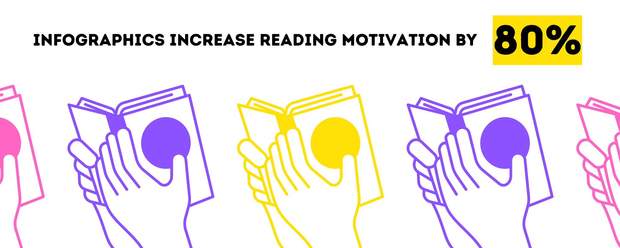
Moreover, infographics increase reading motivation by 80%. That can be attributed to the visual aspects– color, shapes, typography– and the whole flow of the infographic, which makes it easier for people to follow.
Infographics transform difficult ideas into numbers and appealing graphics, which stimulates minds of viewers, resulting in higher marketing conversion rates and quicker decision-making.
Builds brand awareness and credibility
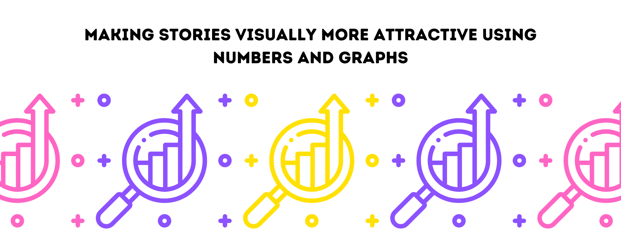
Infographics are a terrific way to demonstrate your business’s unique expertise in a certain area. Making a visually attractive story using numbers and graphics strengthens the trust of your online brand.
Eventually, they will see you as a reliable source of information, adding credibility to your brand. In an internet industry that is always changing and extremely competitive, the more you gain your users’ trust, the more you can ensure your brand’s future success.
Shareability made simple
What do people do with information they acquire? They share. That’s one thing to leverage infographics for: they are shareable.
Their jpeg or png format makes it easy to share them online across various social media sites, unlike text-only content that needs to be tailored for specific platforms. Sharing infographics on social media also increases the number of viewers, and eventually, conversion rates.
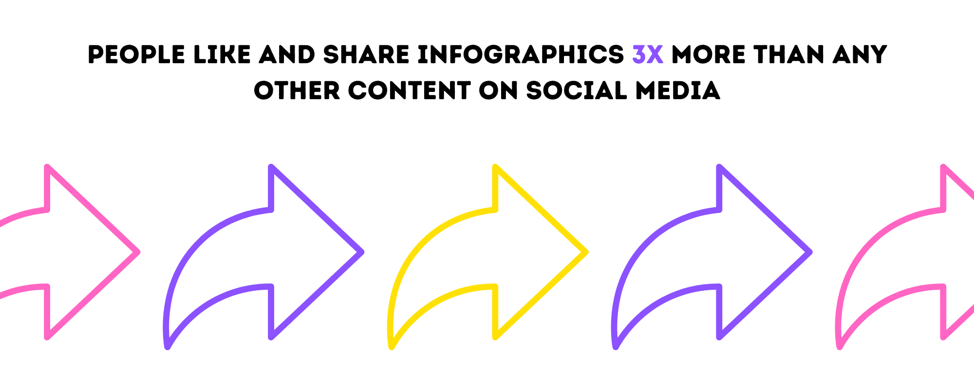
Also, people like and share infographics 3x more than any other content on social media. That could be because infographics are concise and understandable. They feel confident sharing it, knowing people will instantly understand the content.
Works with SEO
Infographics boost user engagement and conversions as they are simple to make, publish, and use across numerous platforms. They are also often used in email marketing, awareness campaigns, sponsored social media advertisements, and business blog articles since they provide content diversity and increased visibility.
Images make information appealing, extending user engagement and lowering bounce rates. Additionally, it helps in generating high-quality backlinks. 45% of online visitors will click on a link if they know it has infographics.
Image SEO makes your website’s photos easier for search engines to locate and index, increasing the visibility and ranks of your content.
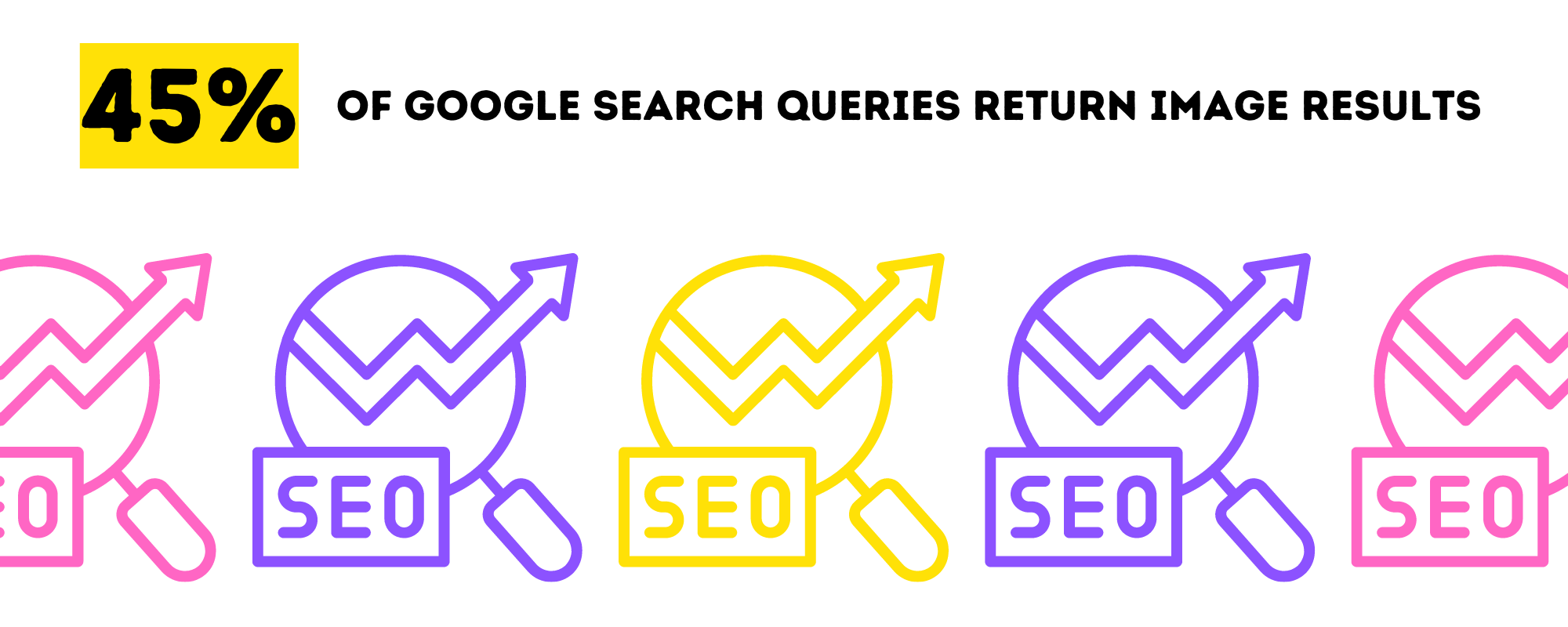
Also, 32.9% of Google search queries return image results. It’s likely they will show up on people’s SERP, people who are already searching for something related to your business.
Drives traffic and web visitors
Infographics have the excellent advantage of increasing website traffic. As people are more likely to share and click on mainly graphic material, these data-graphics can increase traffic to your website. One proof is that articles with infographics get 178% more inbound backlinks than standard articles.
Infographics have brought higher traffic growth for websites for over a decade. They are an excellent choice if the goal of your content marketing strategy is to increase traffic.
Easy to track
Easy to track and analyze, infographics help you to better monitor the effectiveness of your sharable marketing material, and to simply understand which forms of content are better for client engagement than others.
Every infographic you make will convey plenty of key results, in a clear and concise manner, and some might hit the mark more than others.
With the correct tracking in place, it’s easy to track how your infographic marketing efforts are working in order to improve and scale in the future.
Infographics Best Practices
Many businesses have already been using infographics, and lots of brands have been using them in many ways for their marketing strategy. So how can you stand out?
Infographics are very effective, but only if it’s done right. Here are a few best practices worth implementing in your infographic design efforts.
Know your audience
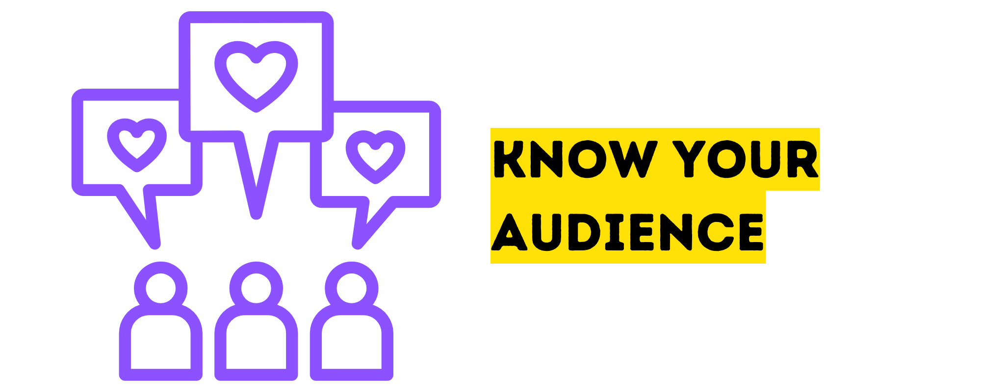
One challenge a lot of marketers face is trying to create an infographic for everyone. As a result, the picture often ends up reaching nobody in particular. This devalues the information and substantially hinders the results. The best way to start is identifying your specific target audience.
- Who are you trying to reach?
- What are their pain points?
- What will solve their problem?
- How can you connect their pain points to the solutions using data-graphics?
- What kind of visuals appeal to them?
These are some of the most important things to consider at the beginning of the design process. That way, your infographic has this personalized touch tailored to a certain demographic. And it’s better to tap a few but important and interested people, than reaching many but with no positive results.
Focus on one main point

Infographics aren’t the place for taking an in-depth dive into a topic.
There are other times and contexts when in-depth material is appropriate, such as in a lengthy blog post, an ebook, or an online course. An infographic is simply intended to graphically present a set of data or supporting arguments for one main point.
Each time you’re getting started on a new infographic, you need to settle on the topic, and don’t go into multiple interpretations, side arguments or tangents of your main point. Make it as easy as possible to see and grasp your idea right off the beginning.
Get the most out of visual elements

An infographic would be nothing without visuals, and choosing the right ones to use is important. Infographics contain texts, but as much as possible, your visuals should still make sense even when most text is gone.
Data may be shown in a variety of ways. There are various data visualization techniques that work better than others, depending on what you want to show.
Here are some tips:
- Use bar charts if you’re showing proportions between data points.
- Use maps if you need to show the distribution across a particular geographical area.
- Timelines are the best tool to visualize time.
- Flowcharts are an ideal way to showcase hierarchies or other chronological data and information.
- Use Venn diagrams to compare information, and circle charts or stacked graphs to compare numbers.
And lastly, photos. Use relevant, captivating photos that can easily be associated with the topics of the infographic, and make sure it adds value to your overall presentation.
Make a flawless flow
When your audience sees your infographic for the first time, where does their attention go right away? Are they interpreting the infographic in the right sequence, or is your information scattered?
You need to make sure the flow of your infographic makes sense, and that visitors know which order to read your facts and supporting arguments in.
There are two ways to visually tell the reader where to go: first, place your elements in the right arrangement; or second, by using a line, arrow, or other visual cue.
Choose 2-3 complementary fonts
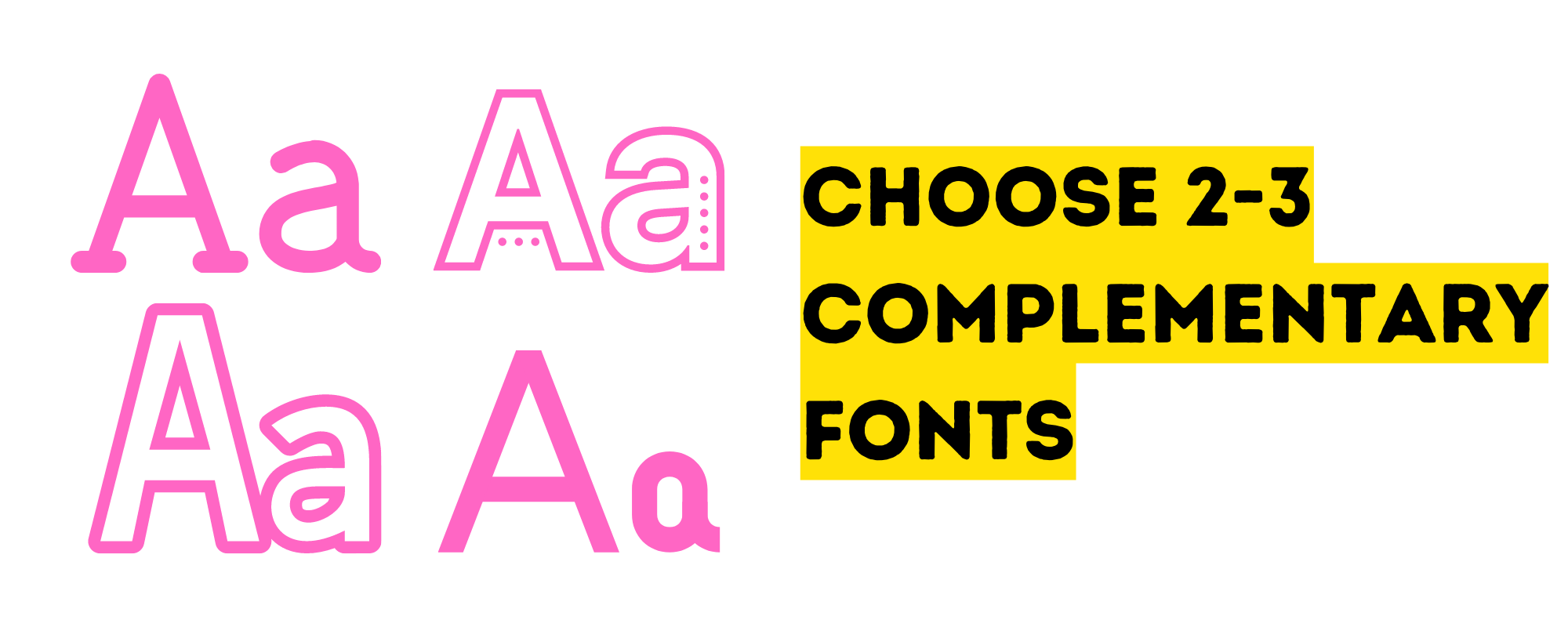
It might be really challenging to choose the ideal font. There are simply so many choices available. When it comes to infographic design, you should avoid using decorative or script fonts unless you’re using them in huge text for a header.
A mix of serif/serif, sans serif/sans serif, or serif/sans serif is a proper starting point.
Keep in mind that you shouldn’t combine two fonts from the same category. You want to have contrast as much as possible, so people can easily tell which is which.
You can do it with font sizes too. You shouldn’t use a body font size of 24- or 28-points if your header is in a 30-point font. These are too similar, and it will be difficult to tell your headers, subheadings, and body material apart.
Instead, pair your heading font size to a smaller body font size. You made it simple for your readers to distinguish between headers and body copy.
Select a simple color scheme
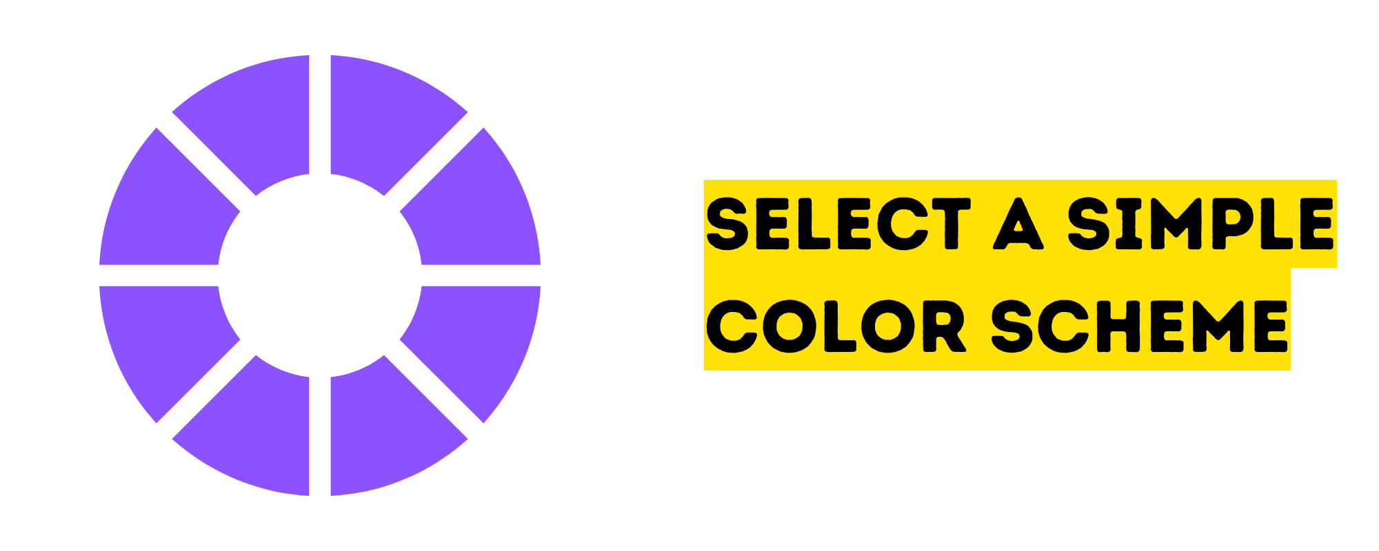
The color palette you choose for your infographic will have a significant impact on how it attracts people’s attention.
Use a basic color scheme that somehow corresponds to the colors of your brand. If not, make sure you at least choose colors that harmonize the infographic’s numerous elements and make it simple to read.
Similar to your choice of typefaces, you might want to limit your colors to no more than two or three. It becomes more appropriate to design a multicolored infographic if you’re using colors that are on a spectrum, like a rainbow or a variety of tones of one color.
Use white space

Your infographics will be easier to read and navigate if there is enough white space. White space is the area between content and infographic components. It helps your design “breathe”.
White space guides a reader from one element to another, establishes harmony, balance, and promotes brand design. The goal is to present information that readers will find interesting and useful and to make the infographics look simple and easy to understand.
Outsourcing your infographic content
While there are more tools now that makes DIY graphics easier, it’s still different when you hire professional graphic designers.
One of the most outsourced tasks is graphic design. Fiverr started with icon sets and other graphics you can purchase for $5.
You may need infographics for seasonal promotions or one-off projects like a buyer’s guide or a company whitepaper. Outsource your graphic design to maximize the advantages of both infographics and having professional graphic designers.
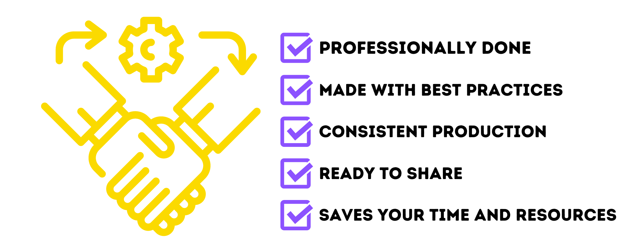
Professionally done
You won’t have to worry about garish combos or looking a bit too template-ish as you might when you use the ready-made, fool-proof templates in DIY platforms. Your graphic designer can create your infographic with your brand style and character, using just the right fonts and colors.
Made with best practices
Outsourcing infographics also makes sure you’re implementing best practices in design, content and SEO.
Consistent production
A graphic designer can also immediately see any previous designs’ parameters and adapt, or establish a style guide if you’re starting out. This results in a cohesive design and brand style across all your platforms in social media and your website.
Ready to share
Professionally done infographics get shared more by your target audiences. After all, they don’t want to share something clumsily done and cluttered.
Saves you time and resources
Investing in your infographics by outsourcing to professional designers help you attain your goals for the graphics without the time and money lost on trying (and failing) the DIY route. The sooner you look professional and high authority to your audience through sleek infographics, the more ROI you get.