
Unless they choose to turn off their connection, people are now always online. Innovations in telecommunications and mobile devices have made the internet a mainstay of mobile devices.
According to Exploding Topics, 92.3% of internet users are using a mobile phone. And it’s safe to assume that the majority of your online business’ customers are also mobile users.
And that’s the main reason why your online assets should always consider mobile design.
What does it mean to be mobile-friendly?
There are 3 main considerations to being a mobile-friendly website: Aesthetics, coherence, and performance. It should look good, make sense to mobile users, and it should perform well. These 3 aspects encompass the mobile experience.
Think about it: If you went out with a friend, you would have had a positive experience. And sometimes people would say: “Even if there were some bad experiences along the way, as long as I’m with my friend, everything will be okay.”
That might be a literal way of thinking about it, but it is the philosophy of a mobile-friendly website: Striving to provide a great experience to users. Even if you fail on some things, the user still has something positive to take away.
And speaking of good experiences, here’s how we quantify and understand what constitutes a great experience for the user.
Key Components of Great Mobile User Experience

Functionality
Users expect functionality, of course. Links are not broken, pages feel responsive, and assets load properly.
Another huge aspect of functionality is integration with other mobile apps. To be mobile-friendly and to provide a great user experience, your site must work well with the mobile ecosystem.
For example, you have a phone number in your mobile site. If a user clicks on it and it doesn’t pull out the user’s native phone app to make a call, then it’s not a great user experience.
Design
Mobile-focused design is very different from normal web design.
- You have a smaller screen to work with. You only have limited space to put assets and content.
- Users can use both portrait and landscape mode when viewing the site. Assets should not be static. Flexible elements work best for you.
- The way users browse mobile sites are very different from how they browse websites for computers. The user is more likely to bounce to other websites so the design has to be more captivating and intuitive.
Design isn’t just about aesthetics, it’s also about influencing the user’s behavior. For example, the Ikea stores are designed in such a way that to make sure that the customers go through all of the products and how the products would like in rooms before moving into main sections.
Mobile design should be designed simply enough for the customers to easily understand yet persuasive enough to influence how they browse and take action.
User Input
As the YouTuber and tech reviewer Marques Brownlee said, “Good phones are getting cheap and cheap phones are getting good.”
People expect quick responses from apps and sites because they know their phone can keep up. You won’t see a user blame the unresponsiveness of a website on their phone. So you have to really make the user inputs feel as fast as they can be.
Another consideration for user input is familiarity. The mobile design has a structure that most sites follow. And it might be tempting to break that mold to stand out. However, that might break the customer’s experience.
You can follow the conventions up to a certain point, and include something unique. There will always be risks involved when breaking out of the known pattern, but there’s also infinite rewards when you take intelligent risks.
Content
Mobile content consumption is like snacking behavior. It’s a quick bite but it gives you what you need. You can’t put walls of text trying to exquisitely explain what your product is. It has to be smart and snappy.
It can also be fast and loose. Like snacking, you can have just food just to give a quick satisfaction or you can have protein bars which is a quick bite but it’s good for you. Either way, it’s not a full-course meal.
That’s also the mantra behind mobile devices. They are with you everywhere: On the go, on the couch, at work, and at home. So your content has to be accessible and can be consumed as fast as possible.
Full-course meals have its place. And you certainly can’t enjoy a full-course meal when you’re on public transport on the way to work and your stop is in 15 minutes.
Credibility
A great user experience is something where trust is simply woven into the experience. Users don’t even have to wonder about it.
But imagine this scenario: A user goes to your mobile site and spots one typo. Depending on the user, they either leave your site immediately or shrug that off.
After getting on the checkout page, they notice one image is not loading properly. “Hmm. I’m not quite so sure about this site anymore. Maybe I’ll buy somewhere else.”
That’s how easily you can lose your credibility on your mobile site. Sure, there might be people who don’t notice those little things. But for those who do, they are not alone. They might have friends or family that can be potential customers too. All of those potential customers can be lost due to little things.
Mobile-First Design vs Responsive Web Design
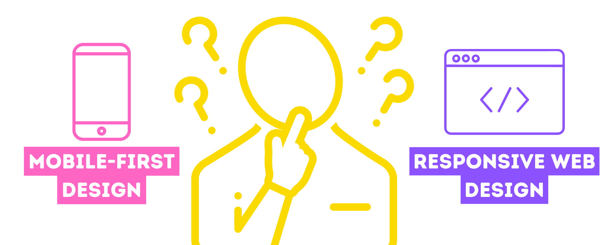
Mobile-first design is web design meant for mobile devices. Responsive web design means that your page can accommodate multiple aspect ratios, screen sizes, and orientation.
Responsive design is mainly the adaptation of your website to the user’s screen while mobile-first is designing your site especially for mobile. We can say that responsive design is a part of mobile-first but not the other way around.
The major difference between them is intent.
Mobile-first is a strategy that all of the decisions from ideation to implementation all relates to being mobile-focused. Responsive web designs’ nature is more about adapting to mobile conventions.
Think of mobile-first as predetermined while responsive as reactive. Both have advantages and disadvantages in web design. But it’s important to remember the distinction between the 2 approaches to understand why we’re doing it and to measure if it works correctly.
Mobile devices come in very different sizes. You can have small phones like the Asus Zenfone 9 to gigantic tablets like the Apple Ipad Pro.
But aside from screen real estate, we also have to take into consideration the browsers that users have. Apple users might use Safari or Chrome while Android users might use Chrome or other browsers like Brave or Opera.
All of those factors have to be considered when creating a mobile site. As much as we discourage having a “one-size-fits-all” approach in other cases, mobile web design is the opposite.
You really have to make sure that your web page fits all screens and all browsers.
Mobile Design Best Practices and Perspectives
Now that we understand the key components of mobile design and the difference between mobile-first and responsive design, you can apply these concepts in these best practices and perspectives.
Easy Navigation

When you are sitting in front of a screen, whether that’s a laptop or computer, you are focused and you will take time to navigate. So unconventional or unique websites can be implemented.
However, mobile users are very different. They can also be sitting somewhere comfortable, browsing away. Or they can browse in short bursts. Open the website, put the phone down, do something, continue browsing, and the cycle repeats.
And aside from browsing behaviors, not all users are tech savvy. Though mobile internet usage has been growing and the internet has been established as a norm now, there are still some people who are not familiar or have difficulty with mobile browsing.
All of these behaviors and considerations can be addressed by an easy and intuitive navigation.
You might say that ease and intuitiveness is subjective, which is a great point. But if you make it as simple as possible, people will learn and understand how your site works fast. And they will associate their browsing experience with ease and intuitiveness.
Organized Information Layout

No matter how diverse our perspectives are, people can understand order the fastest. There is just something in the human brain that rewards order and organization.
So having an organized information layout would make the most sense to any type of user. People can observe and understand patterns, hierarchies, and groupings.
So if you lay out your information in an organized way, users will have an easier time navigating.
For example, let’s say that you’ve designed your web page so that if a user adds an item to the cart, they will be automatically brought to the checkout page. That can nudge some customers into purchasing but it’s really a bad way of organizing your webpage.
Imagine being in a grocery store to bake a cake. And once in the store, you put the flour in your cart. But before you get the other ingredients, the security guard already escorted you to checkout. It will end up as a bad experience.
Consistency and Uniformity

Nothing takes a user out of immersion and focus than something out of place.
Think about it: If you are a driver and you could review expressways, even just one bump in a 3-hour drive can be enough to dock a star. The rest of the drive might be smooth but one bump already gave an inconsistency to the smooth ride.
Consistency should encompass the functionality, the aesthetics and your branding. For example, if your brand has a light comedic tone in your social posts but your website is super serious, it’s going to be very jarring for users, especially the ones who are new to your brand.
Uniformity on the other hand is important but should be used very carefully. Because if you make most of your assets too uniform, it can be bland to some users.
The best way to implement uniformity is on pages that are formal or have to involve trust, like the checkout page. Users won’t complain that the checkout page is “too uniform.” They won’t even notice it, if your implementation is good.
Readability and Visibility

Mobile users are mostly mobile. They can be on the go, on the commute or traveling somewhere. And that is a big consideration when it comes to readability and visibility.
And it’s not just about font size. It’s also about contrast. Avoid similar colors of foreground assets (like buttons and text) and background. A good rule of thumb is light assets to dark backgrounds and vice versa.
Spacing is also a factor to and visibility. Placing walls of text especially in a mobile device does not look appealing to most users. They expect browsing a mobile page, not reading a legal or business document.
Lastly, placement is key to good visibility. As much as possible, buttons and links should be placed near the top or the center of the screen. You don’t want users to do additional scrolling before they take action.
Quick Loading Speed

As we have said earlier, mobile browsing has a different mentality. And if you notice on the metaphors we used, browning mobile sites is more akin to driving/riding. It’s on the name itself: Mobile – mobility, movement.
So if a user browses mobile sites, they expect speed. They won’t stay at all if your loading speeds are low.
Milliseconds matter. So if you want to compromise pretty assets for speed, that is a good risk to take. However, don’t just scrap all the things that make your site beautiful. Stick to what serves your brand with a fairly decent aesthetics, and focus on functionality and speed.
Prioritize Core Features

When thinking about your mobile layout, think about how modern Spotify music is structured: You have a preview of the hook (chorus) at the beginning, a short verse, a pre-chorus, and a fleshed-out, complete version of the hook. Then, the cycle repeats except the hook preview.
You can have a bridge or instrumentals for some variety. But typically songs last from as fast as a minute and a half or a bit above 3 mins.
So in mobile web design terms, that translates to having your core feature or core product highlight at the initial glance. Then, have a short but satisfying tidbit of information. Prepare their expectation for the main feature. Lastly, present the main feature in all its glory.
Make it simple and seamless but memorable and repeatable like Spotify songs.
Incorporate CTAs

When browsing on mobile and in general, people are usually preoccupied with something. It even seems like people are moving on autopilot. Because usually, users aren’t too focused on browsing.
So having helpful nudges through CTAs will make users take action. After all, the main goal for all websites is to make the users take action whether to purchase something, sign up for a newsletter, follow your social media sites, and so much more.
Improve your site’s mobile design

As you’ve figured out by now, mobile design is very important that any online business should consider learning about it and understanding it.
But there are a lot of considerations and complexities to implement mobile design. Sure, there are some web platforms that already have mobile designs ready. But it’s almost always not good enough for your customer.
We highly suggest hiring experienced mobile web designers to implement these for you. Because with how crucial web design is, you really want it to be working well for your customers.
Partnering up with outsourcing agencies like USource can connect you to web developers who can help you implement mobile design to your online sites that work great and provide a great experience for your users and customers.
As business owners, you still have the responsibility to understand the whys of how things are done and what to look for.